The price of my magazine is going to be £1 for students of Wyke and £1.40 for any other person, these differences in price will encourage students from Wyke to buy it as they'll see that they get a discount. I have chosen these two prices because they are affordable, this is crucial as most first years now don't get any source of money income. ( EMA)
I have chosen to publish my magazine every two weeks, I have chosen this because there will be enough interesting things to insert into the magazine without struggling to find gossip. I believe that two weeks is a good time scale because it gives students time to relax and know what's happening in the weeks ahead without checking each couple of days.
Saturday, 29 October 2011

Target Audience
The target audience for my magazine will be mainly students that have just started Wyke, this ties in with the name 'fresh' which is short for freshers. The main image on the front cover is also a person that has just started Wyke. The main story of the magazine is about that specific student's first couple of weeks at college which relates back to the new students that have currently joined. Other headlines focus on music, fashion and the Wyke Halloween party this could interest not only first years but second and third. So therefore anyone in Wyke could read it and find it useful and interesting. As a whole the target audience is young students but it can be purchased by anyone. Even though most of the magazine is mostly based on teenage stereotypical interests there are many stories also in the magazine that are academic and useful for helping with students work at college which ties in with the main headline.
Thursday, 20 October 2011
Wednesday, 19 October 2011
Research
Here are some photos I have taken that I may use on my front cover.

I like this image but I think that their isn't enough room for the mast head and the skyline.

I like this image but I think that their isn't enough room for the mast head and the skyline.
 I prefer this image as their is more room for a skyline and mast head. Also the person in the image is giving the audience and contact. Apposing this, in the first image she looks more happy so I decided to use the first image but crop the top of this image and put it on the other to give more space above her head.
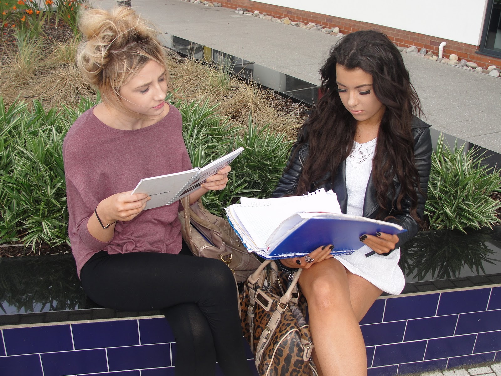
Here are some images I may use for my contents page. ( All taken by me )

I think that having photos of people socialising in college is a big thing because that is a big part about college creating new friends. This image shows two people walking down the OAK staircase while talking.




Friday, 7 October 2011
Conventions of magazine

Language- The masthead is short and memorable as its 'Faze'. The colours used on the front cover is usually dominated by red, black and grey which is the house style. The main image of a young model giving the audience eye contact, this image dominates the front cover. The price and barcode are situated in the left hand corner, this shows that this magazine has a fixed price and it can be scanned and bought. The main article is obviously about 'Taylor Mommsen' because it's the biggest main feature on the front cover and also the image is of Taylor. There are also other small thumbnails on the side that give you information about other stories that are also in the magazine.
Institution- The institution of the magazine is 'Faze' which is created by the company.
Ideology- The magazine seems to promote teenagers interests such as music, fashion and celebrities. The model on the front cover seems to be influenced by music and style as she is wearing stereotypical rock clothes. With further research I found out that the model on the front cover is Taylor Monsem a actress and singer from the band The Pretty Reckless. Also on the left third one of the kicker stories is ' be happy, five feel-good foods'. This shows that the magazine designer knows that some teenagers are worried about their weight and happiness so therefore it is in the magazine to help these people have a healthy lifestyle.
Audience- The audience is teenagers as the teaser is 'Canada's #1 teen' It also it’s Canadian so it's obviously for mainly Canadians. Also the sell line 'The travel issue' gives the impression that any teenager can buy it because travelling is popular and exclusive.
Representation- The magazine shows teenagers as interesting and constantly changing people as the magazine is called Faze. The magazine front cover touches on subjects such as sport, music and celebrities so it gives you a range of current things. It doesn't pursue negative look on teenagers or positive just a mutual.

Language- The college magazines image is a medium shot with black, white and greenish yellow text surrounding it. The background is mostly in black which makes the model stand out as he is wearing a white top. The left third and right third is where the subtitles and story lines are placed, this is iconic because when stacked in a store this is the text you see first.
Institution- The institution is for education and the publisher is College lifestyle.
Ideology- The ideology of the magazine suggests that college is fun as the model is smiling. He is also holding college books which presents that he is smiling because he enjoys college and that he's content. This magazine shows this college in a positive light. The Magazine also tells you information about the college campus and how you can benefit from this.
Audience-There are 60-70 thousand viewers of the mag. The audience is aimed at young students I believe because college is for young adults. This is backed up by the skyline ‘your exclusive guide to everything hip, hot & happening’ The use of words used in this does seem to want to connect to young people as it's short snappy and slang.
Representation- The magazine views education in a positive light because of the cheery model. Also by using an African American as the model it shows that there is no racism within the college which will make people of a wider audience want to attend. Using teasers such as 'make money on campus' makes teenagers think that it will also benefit them financially to go to this college.
Friday, 30 September 2011
Magazine Front Cover Terms
Masthead title piece The magazine's title. Usually displayed in the top left corner.
Price Magazine cost.
Date Weekly:usually from Saturday to Friday. Monthly: a month ahead.
Issue Number A tally of magazines.
Barcode Read electronically and decoded into usable information.
Teaser One word/phrase acts as an attention grabber.
Main Feature Headline A phrase that may summarise the main point on the main feature. In large print, different style, bold colours in order to catch the attention of the reader.
Subtitle Smaller headline that may summarise the feature.
Smaller Feature Features included in the magazine.
Images Size CU to med CU. Ranges from the main image to x amount featuring one main image and smaller images. Helps make the page look more interesting. It can add understanding of a story and/or entice someone to read the magazine.
Font Style and size of a type face.
Colour Specific/stylistic/thematic types.
Graphics Graphical shapes to highlight feature(s)
Offers/adverts blurb Banner Style shape featuring free products/promotions.
Sell Lines Small text that sells the title.
Left Third The left side of the magazine that holds headlines.
Splash Graphics that resemble words.
Credit Credit given to the people that have worked on the magazine ( such as the photographer )
Kicker This Leads you in to the teller by using catchy words.
Teller A short box of information about the subject.
Skyline Headline above master headline.
Flash Graphics that resemble words.
Graphology The art of using graphics.
Anchorage Putting captions on photos to explain the image.
Colour Scheme Colours presented in the magazine.
Vocabulary Information relevant to the magazine.
Screamers Using things such as '!' to create emphasis.
Images Photos taken that are inserted into the magazine.
Peliminary exercise
using DTP and an image manipulation program, produce front the front page of a new school/college magazine, featuring a photograph of a student in medium close-up plus some appropriately laid-out text and a masthead. Additionally you must produce a mock-up for the layout of the contents page to demonstrate their grasp of DTP.
Subscribe to:
Posts (Atom)