Creation Of My Contents
Firstly, I started of with a grey band across the top, similar to the colours on my double page spread and front cover. I once again have put the name of my magazine 'VOLT' on the top with the same font so it keeps the continuity and the audience will know what they are reading. I have outlined all letters in a stoke effect to make them bolder and recognisable.
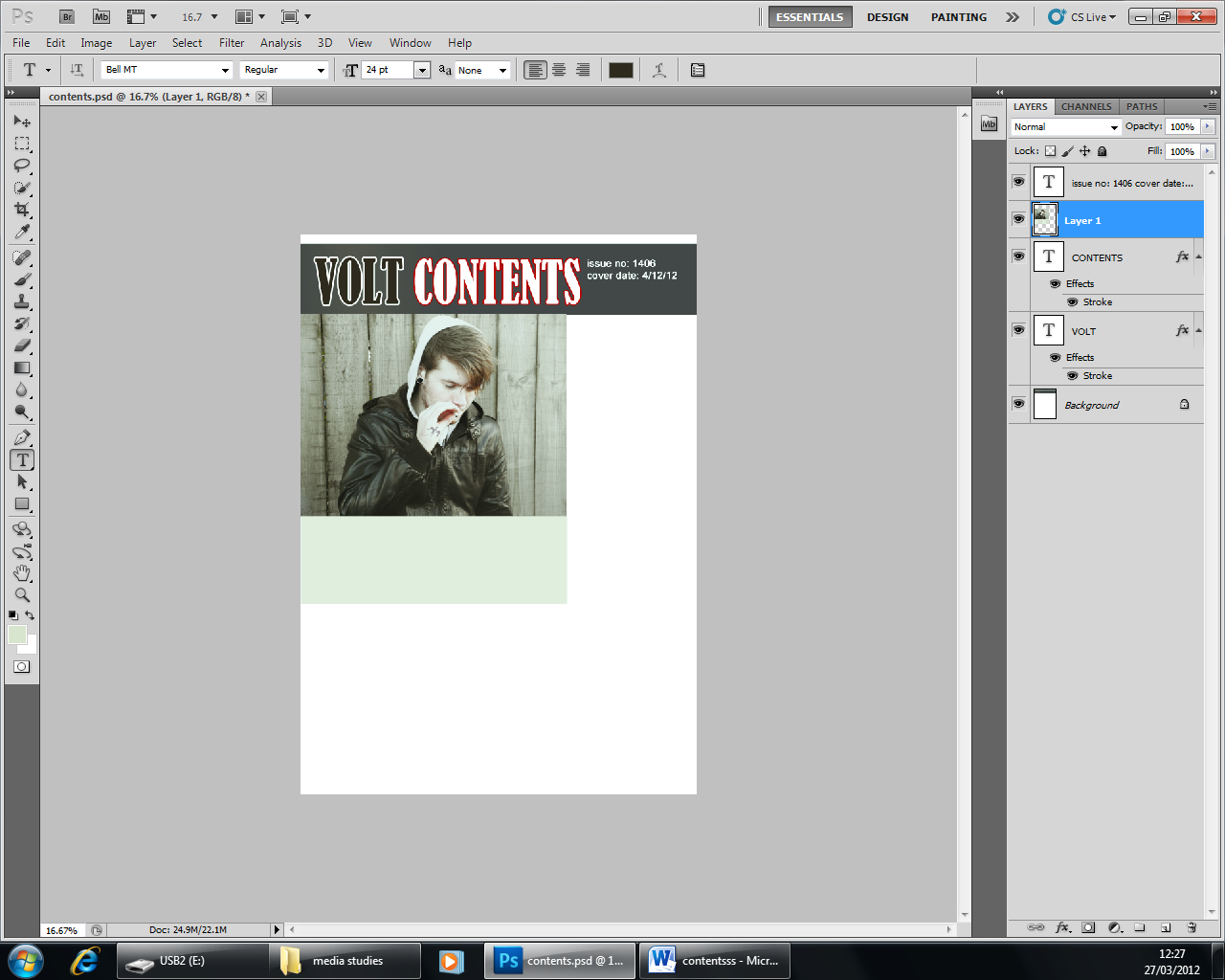
An image I had taken for my front cover I felt was perfect for my contents. I added a swallow on his hand to make it look like a tattoo by copying it onto him and blurring it out. I also took a lot of colour out of the image to match the other ones.
As I used for the double page spread and the front cover I once again have liquefied Adam's ear to give me enough room to add a plug that I got an image from on google.
Result of this, although there was a few missing parts in the middle of the plug which I then filled in with a paint brush.
I then added it on my contents and also added an issue number and a date. I created a box underneath the image to add the main competition ( to win a guitar )
I used the shape icon to create a star and I used a stoke effect to make it bolder, later on I change the star yellow as white I felt was to similar to the grey box and that yellow would make it stand out more.
I opened this image up separately selected, copied and pasted it into my contents. I also reduced the vibrancy and changed the colour so it would fit in with the other colours of the other images on my magazine.
I then made more boxes to put my main headlines on so they were easy to see.
I then added text, using the font Arial so it was easy to read.
I also scanned this in for the bottom of my contents to make it look personalised.
Final product after inserting text on publisher, I also decided to change the image and use a similar one as it looked to stretched. I made the numbers of the pages bigger so they are easy to spot!


No comments:
Post a Comment