Wednesday, 28 March 2012

FINAL PRODUCTS OF MY MAGAZINE.


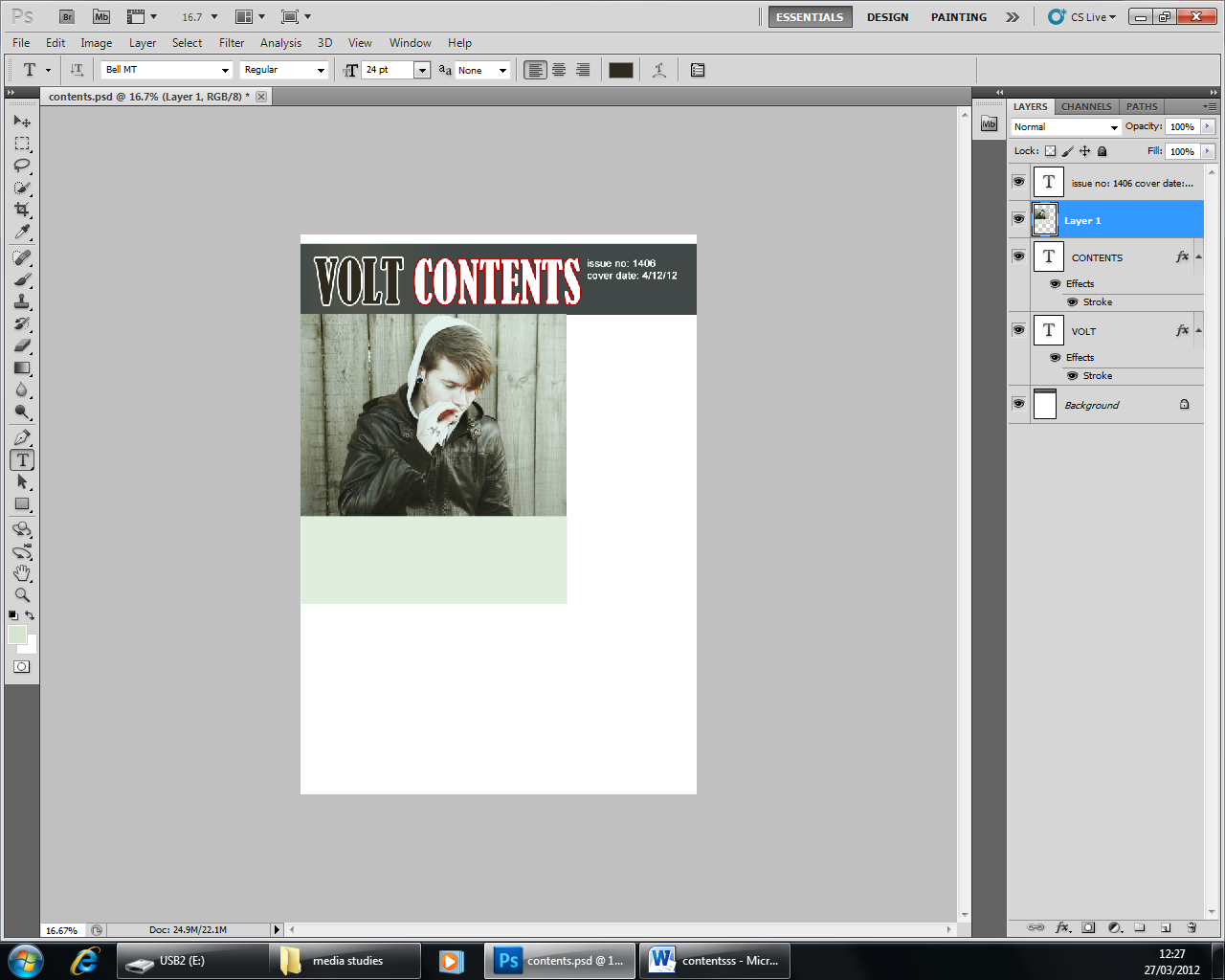
Creation Of My Contents


Firstly, I started of with a grey band across the top, similar to the colours on my double page spread and front cover. I once again have put the name of my magazine 'VOLT' on the top with the same font so it keeps the continuity and the audience will know what they are reading. I have outlined all letters in a stoke effect to make them bolder and recognisable.


An image I had taken for my front cover I felt was perfect for my contents. I added a swallow on his hand to make it look like a tattoo by copying it onto him and blurring it out. I also took a lot of colour out of the image to match the other ones.


As I used for the double page spread and the front cover I once again have liquefied Adam's ear to give me enough room to add a plug that I got an image from on google.


Result of this, although there was a few missing parts in the middle of the plug which I then filled in with a paint brush.


I then added it on my contents and also added an issue number and a date. I created a box underneath the image to add the main competition ( to win a guitar ) 


I used the shape icon to create a star and I used a stoke effect to make it bolder, later on I change the star yellow as white I felt was to similar to the grey box and that yellow would make it stand out more. 


I opened this image up separately selected, copied and pasted it into my contents. I also reduced the vibrancy and changed the colour so it would fit in with the other colours of the other images on my magazine. 


I then made more boxes to put my main headlines on so they were easy to see.


 I then added text, using the font Arial so it was easy to read.


I also scanned this in for the bottom of my contents to make it look personalised.


Final product after inserting text on publisher, I also decided to change the image and use a similar one as it looked to stretched. I made the numbers of the pages bigger so they are easy to spot!


Tuesday, 27 March 2012

possible images to use for contents from Sonisphere 2011

I like this image I took of an All Time Low member as he looks like he's having a  good time.

I don't think I'll use this image a I think the man in the background ruins it a little.
This image is humorous and I think it would fit my magazine perfectly as from the guitar it looks like the alternative/rock genre. 
I am very proud of this photo as it shows this band member to be having a good time on stage. The colour of the background also makes him stand out a lot!
I like this image as it is very clear and the background is slightly blurred out which gives all the attention to him singing.

Ideas for contents

I have decided to use a Kerrang contents as my influence as I'd to think mine is a similar genre. The specific contents I actually am going to use is situated below. The reason I like this contents so much is the colours, they're bold ( blue and yellow ) and they draw attention. The use of a mix of graphics, photo's and text I also like as it gives the page character. The personal touch of You Me At Six's handwriting I'd like to use and the adding of competitions to keep the reader interested.

Thursday, 15 March 2012

Creation Of Double Page Spread

This is the image I have chosen to use for my double page spread,  this was my favourite out of the photo's I have taken because the high angle shot makes him look dominant. The fact he is also smirking shows he doesn't take himself to seriously as a artist. The clothes he is wearing also makes him to be quite rough edged and casual as I didn't want to make him look like he cared a lot about what other people thought about him.
The only problem with this image was that he was to in the centre to use as a double page spread image so I decided to use the clone tool to add more fencing to the right hand side so he'd be more to the left. After this I used the smudge tool so you couldn't tell it had been edited.
Although my aim was not to make him look very airbrushed I did use the patch tool a little to remove some of his blemishes.
Result of doing this


I then used the paint brush to make his t-shirt more red, I copied the colour from the front cover so it was similar and you so you could tell it was the same magazine.

Using the liquefy tool I then made his plug bigger as it had to match the one on the front cover.

Using the same tool I made Adam's nose ring smaller.

Using the clone tool again I removed the logo from his hat.

I then created a box and made it the same colour as a previous colour on my front cover and wrote in the headline ( pull out quote ) and sub headline using again the same kind of colours as the front. This I think is important so it carries on the same style. I also added photo credit and a page number so it was conventional. I also dimmed the photo, reduced the vibrancy so it looked 'rusty'. After this I went on publisher and wrote out my story, I used this because it's easier as the lines are more equal. This is my final product.

Wednesday, 14 March 2012

Images taken for my double page spread

The main aim of these images were to make him look dominant by giving him a high angle shot. I also thought it was important to use the same background to tie in with the front cover well.
This one I didn't use because it was to close up and he's squinting in the sun, also this image makes him look innocent so I didn't think it was appropriate as the story was about his drug addiction.
This was my favourite image as he dominates the image and also the high angle shot helps this. Also the image was in a great position for me to create it into a double page spread with him on one side and the text on the other. The way he is holding his hands also make him look like a big character.
I think this image wasn't clear enough to use and once again the sun is in his eyes! I also thought it would be better if it was a medium close up to focus more on his body language.
I felt this one was to humorous to use as the image as I wanted him to look smug.
Once again, to humorous and not enough focus on himself, the area around him dominates him to much. 
The angle of the shot I liked but he didn't look serious enough.


I did nearly choose this one as it shows Mitch's personality a lot as he doesn't care what people think of him in his interview.


This would of been a good image but he was talking!
I like this one as it shows his personality ( laid back ) 


I didn't think this image showed him as the person he is meant to me as he looks small and not outgoing by the low angle shot.

Monday, 13 February 2012

Re draft of front cover


I felt the barcode was too big on my front cover and this made it unrealistic so I decided to make my own on a code generator which I also put the issue number and date on.
I placed and rotated this to fit the image

I thought the sticker on the side of the mast head had to much space in between the sticker and the writing so I changed the size on the circle to the best size I could. The mast head I also decided to change as I thought this one fitted the grunge type magazine better as the last one I thought looked a bit to 'pop' like. Along with this I changed the headers, I think it looks more suitable and bolder now.

I felt there wasn't enough at the bottom of the front cover which let it down a little so I inserted two photo's I have took from a gig of All time Low with house style bold outlines to keep them stood out, I also drained most colour out of them to match the image..

My final product was then again changed, I felt my images weren't involved enough so I moved my story to over lap my images. I placed the two images out like a pack of cards. As a result of moving everything down it filled a space that was very bare. I also moved the sticker up and made it stand out more by using a stroke effect on my font and also with my skyline. My final change was on the little sticker in right hand corner. I thought it looked unconventional to have the word sell instead of selling so I changed it and put it on one line.