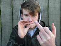
I like this image as I wanted him to look quiet 'thugish'. This could also be easily made smaller to use as a front cover image.
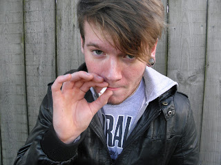
This image I believe wasn't suitable as it was to close up and the eye contact is limited as his hair is over his face. Also there is not enough room to put a skyline above.
I like this image so therefore I think I may use it in my contents but it's not suitable for a front cover image.This image I disliked the pose and his hair is in his face again to much!
I thought about using this but I think his hand takes up to much of the image and it could become a problem to write text on it.
I don't think this can be used as it isn't clear enough and there is houses in the background which don't make it looks very professional.


No comments:
Post a Comment