I experimented with many different colours to find the style I wanted, these are a few of my favourites.
Monday, 19 December 2011
Friday, 16 December 2011
Prints screen of final product
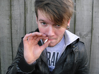
firstly I picked a photo that I thought was most suitable for a front cover of a rock/alternative magazine and uploaded it on photoshop.

I thought this was the most suitable because he is giving the audience eye contact, I also like the pose he is doing and the choice of background as it creates a 'grungy' look. The only problem was that it was landscape not portrait and their wasn't enough room above his head to put a mast head. By cloning the existing boards I began to recreate the top of the image. This took time as it had to be a perfect match to look convincing.
 As I was doing this I airbrushed the sides to make it fit more. I also used the layer mask tool which faded the cloned piece into the existing piece.
 End result. After this I emerged this image as one so it became less hassle as if I was trying to move something it wouldn't move each single board.
 I then began to reduce the vibrancy to make it look duller, I think this is a great idea for my magazine as most rock/grunge/alternative magazines use this technique.
 I then made the grey part of the eye white, as it makes it look more eye catching.
 I used the patch tool to get rid of all imperfections on his face to make it look more smooth but natural at the same time.
 As most people involved with rock music have piercings etc, I decided to liquefy his ear so I have enough room to insert a tunnel ( image from google, cropped and pasted into ear)
 Result of ear after I used the blur tool to make it look more realistic.


I thought this was the most suitable because he is giving the audience eye contact, I also like the pose he is doing and the choice of background as it creates a 'grungy' look. The only problem was that it was landscape not portrait and their wasn't enough room above his head to put a mast head. By cloning the existing boards I began to recreate the top of the image. This took time as it had to be a perfect match to look convincing.


 I then began to reduce the vibrancy to make it look duller, I think this is a great idea for my magazine as most rock/grunge/alternative magazines use this technique.

 As most people involved with rock music have piercings etc, I decided to liquefy his ear so I have enough room to insert a tunnel ( image from google, cropped and pasted into ear)
 Result of ear after I used the blur tool to make it look more realistic.

As I thought the writing on his shirt would interfere with headlines on my magazine I decided to get rid of it by using the clone tool.
For my mast head I decided I wanted something bold so I decided to outline my mast head by using a stoke effect and drop shadow.
As the mast head was simple and short, I decided to hide it behind my model by using the eraser tool.

I ten began to add a skyline, still following the colour scheme as it makes it look more professional.
After adding the writing on skyline using an arial font, so it makes it easy to read.
I then added a barcode to the bottom of my magazine.
After this I added my main storyline making it bigger then the other stories, using similar effects from the mast head like the sroke effect.


End Result.
Wednesday, 14 December 2011
Photos for Magazine
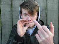
This wasn't suitable as a front cover image as their is no eye contact so therefore this is unconventional.
I like this image as I wanted him to look quiet 'thugish'. This could also be easily made smaller to use as a front cover image.
This image I disliked the pose and his hair is in his face again to much!
I thought about using this but I think his hand takes up to much of the image and it could become a problem to write text on it.
I don't think this can be used as it isn't clear enough and there is houses in the background which don't make it looks very professional.
I like this image as I wanted him to look quiet 'thugish'. This could also be easily made smaller to use as a front cover image.
This image I believe wasn't suitable as it was to close up and the eye contact is limited as his hair is over his face. Also there is not enough room to put a skyline above.
I like this image so therefore I think I may use it in my contents but it's not suitable for a front cover image.This image I disliked the pose and his hair is in his face again to much!
I thought about using this but I think his hand takes up to much of the image and it could become a problem to write text on it.
I don't think this can be used as it isn't clear enough and there is houses in the background which don't make it looks very professional.
Monday, 12 December 2011
Attempt at airbrushing on Photoshop
I have used many tools to make her completion look better. firstly I used the clone tool to get rid of her imperfections such as her spots, I did this by cloning a piece of her skin that was clear and pasting it over her spots and freckles. Secondly I cut out her skin twice on two separate layers and made one lighter and slightly transparent and the other darker, this creates a more even and lighter tone. Lastly I used the warp tool to made her look thinner.
I will use this in my magazine to make my band member look more even but I will not over use like on this image as the band member shows the real him. Also rock/alternative magazines tend to avoid the image to look perfect as this kind of music isn't soft.
Name of my magazine
Unplugged- I like this name as it could be metaphorical for finding out more about a band members life.
Lava- I like this because it is short and memorable.
Code- This was my original name choice for my magazine, I like it because people's dress code is a big indication of what music they like and what there personality is like.
Revive- This means regain life, I like this because it connects with my band name and sounds catchy.
Volt- Short, simple and original. this is the name I am going to use.
Voltage- force is expressed in volts, this makes the magazine seem like a big expression of rock/alternative music.
Inspirations for my magazine
These photo's of a Day To Remember, a famous rock/alternative band from America. I like the first photo because it's very casual, even though he is very successful the vocalist seems to be in a room that looks very personalised as some people would call is vandalism ( tags on the walls ), this could show that even though he is very successful he still can be like a normal rock/alternative inspired person without spending loads of money and looking really done up... this shows a grungy look.
The second photo I like because even though an image is still you can tell that there is a lot of life in that room by the audiences hands and the way ADTR's vocalist is standing. It also shows he connects with the audience, which is an important part of being successful.
Subscribe to:
Comments (Atom)


