Language- The main image of this magazine is an image of the band Kings Of Leon giving the audience eye contact. The main singer is standing slightly in front of the other band members. They are all dressed casual with an indie twist. The only graphics on the front cover is the V Festival advertisement in the bottom left. There only seems to be one or two different fonts on the magazine. The main font is a Arial San serif font used on the bands name and the logo. Kickers and teasers are all smaller and use thinner and a mix of old fashioned to make it look less important. The main house style is red,white and black. The name of the magazine is dominant but short memorable.
Institution- The publisher is IPC Media, IPC Media produces over 60 iconic media brands, with print alone reaching almost two thirds of UK women and 42% of UK men- almost 26 million UK adults- while they're websites collectively reach over 20 million users every month. NME is a popular music magazine published weekly since 1952.NME sells thousands of magazines every month!
Ideology- The consumer culture is southern rock as that's what Kings Of Leon base there music on. The clothes they are wearing seem to be quiet casual for there music genre. The NME promotes consumption of new "indie" music produced by mostly white male guitar bands and solo artists to an audience which is approaching 70% male. It aspired to be one step ahead of mainstream popular music chart showing successful bands.
Audience- The main audience is readers that believe that music is a big part of there lives, people who like to listen to new bands.52% readers of the NME are interested in taking a musical course/qualification. By putting a popular band on the front cover I think that NME are trying to interest young people epically males because of the colours and the bands shown.
Representation- The band are communicating through eye contact, this is important because it makes the audience feel more involved. The clothing is casual and the pose is simple and not very interesting or crazy.. this usually portrays there personality. From my research of Kings Of Leon shows a change of style, maybe this image is trying to show there new clean cut style created with there new album although there is still a sign of the old style of the band but it is very discrete ( roughness )
Kings Of Leon's old image!
Language- The main image on this front cover is Foo Fighters giving eye contact. The lead singer is standing slightly in front of the other band members. The main colours are red, yellow, black and white, this is the house style. Around three different types of fonts are used in this front cover. The main font is a San serif font which makes it more clear. The smaller headings are also similar. There is also a smaller image of another band member in the bottom left hand corner.
Institution- Metal Hammer is a monthly heavy metal music magazine published in the United kingdom by Future Publishing, and in several other countries by different publishers. Metal Hammer articles feature both mainstream bands and more unusual acts from the whole spectrum of heavy metal music. It is the largest selling metal music magazine in the UK, currently outselling Kerrang!
Ideology- Metal Hammer articles feature both mainstream bands and more unusual acts. The rock/metal clothing style attaches with this.
Audience- The main music style is a rock genre this would attract people who like heavy metal/rock and alternative music. Also in metal hammer there is a lot of rock fashion. I'd say that it is aimed at people who like this kind of music and fashion.
Representation- The image represents Foo Fighters to be fun and interesting. The lead singer is holding out his arm to look like he's going to shake the readers hand, this shows the band are approachable and happy because of there faces. ( Don't take the world to seriously ).
Language- The main image of this front cover from Q magazine is LADY Gaga. The image shows her centre in the magazine giving the audience eye contact. She's half naked and has her hands ( with claws) hiding her breasts. This could show that she is confident and content with her body. The main house style is black, red and white. There are also two main San serif fonts in a range of different sizes, the main colours of these are white and black this compliments they grey background.
Institution- Q is a popular magazine in the United Kingdom published monthly by Bauer Media Group.Bauer Media owns more than eighty influential media brands spanning a wide range of interests, including heat, GRAZIA, Closer, MCN, FHM, Parkers, MATCH, Magic 105.4, Kiss 100, Kerrang.The magazine has a close relationship with the Glastonbury Festival, producing both a free daily newspaper on site during the festival and a review magazine available at the end of the festival.
Ideology- The magazine has an extensive review section: new releases, film and live concert reviews as well as radio and television reviews. Much of the magazine is devoted to interviews and popular music artists.The magazine is well known for compiling lists. It has created many, ranging from "The 100 Greatest albums" to the "100 Greatest '100 Greatest' Lists". Every other month, Q — and its sister magazine, Mojo (also owned by Bauer) — have a special edition. These have been about musical times, genres, or a very important/influential musician.
Audience- Q magazine gives a comprehensive coverage of the current music scene, while not forgetting the trends of yeastier years.Q's audience is composed of passionate, engaged and open minded music fans driven to continually discover new music - and to use this lust for discovery to influence their friends. The audience is split 75% male to 25% female and is affluent (with 68% ABC1).
Representation- The image on this front cover shows the artists Lady Gaga to be rebellious and confident as she is half naked covering her breasts with a claw. It also shows her to have a big personality as the image is outside the box. The Lady Gaga cover of the new Q Magazine has been banned in it's full visual form in the U.S. due to what Janet Jackson's PR firm would possibly have called a 'glove malfunction'. Lady Gaga is shown to be reckless and interesting from this one original image.

Language- The main house style of this contents page that is a part of NME magazine is red, black and white, these compliment each other because they make the information easy to read. The biggest image on this contents page is of the famous band member Diddy. This image shows him moshing, this related to the story below. This image doesn't show eye contact but the front cover does, this draws the reader in. The layout is structured so everything is spaced out, which again makes it easy to read. Graphics are also used below the main story. The font is all San serif, which makes it modern.
Institution- The publisher is IPC media. NME is a popular music magazine published weekly since 1952.NME sells thousands of magazines each year.
Ideology- The consumer culture is Indie as that's what the Artict monkeys base there music around, this also connects with what they wear. This is why it's a shock when Diddy is 'moshing' ( related to the metal genre )
Audience- The main audience is readers that believe that music is a big part of there lives, people who like to listen to new bands.52% readers of the NME are interested in taking a musical course/qualification. By putting a popular band on the front cover I think that NME are trying to interest young people epically males because of the colours and the bands shown.
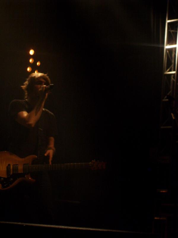
Representation- The image shows individuality and love for music as the musician has a guitar in his hand singing so he must have passion for music because Artic Monkeys are a successful band.


 Result of me adding another image on my chose image


